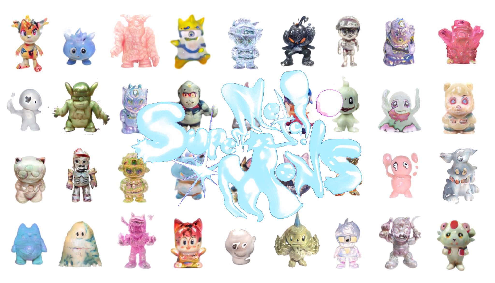
Super Metal Mons! poster (2021) is the type-chart of Supermetal Bosch’s Mons project — a Pokémon-style roster of GAN-derived creatures laid out in a grid, with the project title hand-lettered across the centre.
Close looking
A flat white ground holds a four-row grid of small character figurines, nine across, photographed individually and arranged on a gridless field as if for a trading-card index — the composition is the index itself, a roster laid out for comparison. Each figurine is a chunky, child-fist-sized creature, photographed from the front with soft drop-shadow under each foot, all at the same uniform scale so the surface differences read instead of size. The bodies range across colours and surfaces: pale translucent resin, hot-pink rubbery cast, glossy gold, smudged grey-green, brushed metal, watercolour-marbled porcelain, half-melted silver — the palette is a survey rather than a chord. The variation in surface texture across the roster is the project’s content. Faces tend toward two oversized round eyes and a pinched mouth — a GAN-derived character grammar that lands consistently across the whole roster, even as colour and material vary. Across the centre of the poster, in a chrome-blue, dripping graffiti script with starburst highlights, the words SuperMetal MoNs! run diagonally upward, the letters partly transparent so the figures behind them remain visible. No background, no border, no caption-trait — just the grid of creatures and the title. Reads first: the title’s wet chrome, then the diagonal it sets up. Reads second: the variation in surface across the roster. Reads last: the tiny faces, which are nearly identical across the row — the Mons type as a single character iterated through finishes.
See also
- Supermetal Bosch — the artist
- Mons “estalibur” — single-figure spinoff of the same project
- Visible-seams aesthetic — the conceptual register this poster sits adjacent to
- Little Swag World №1219 — Bosch’s other major project